前端框架搭建
一、下载bootsrap框架
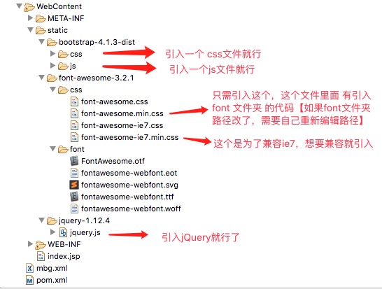
本项目采用的是V4版本,V4版本和V3有点不同,V4版本移除了图库。所以我们需要自己导入其他图库。
Bootstrap框架需要 jQuery.js,同时V4版本还需要 Popper.js。Our
bootstrap.bundle.jsandbootstrap.bundle.min.jsinclude Popper, but not jQuery.
下载 Bootstrap 后,我们可以看到只有两个文件夹,一个是 js文件夹,一个是css文件夹。使用时只需要引入:JQuery.js , bootstrap.bundle.min.js,bootstrap.min.css就可以了。
二、下载图标
Bootstrap doesn’t include an icon library by default, but we have a handful of recommendations for you to choose from. While most icon sets include multiple file formats, we prefer SVG implementations for their improved accessibility and vector support.
We’ve tested and used these icon sets ourselves.
While we haven’t tried these out, they do look promising and provide multiple formats—including SVG.
这里以 Font Awesome 举例,此处代码下载 ,此处使用说明 。
Font Awesome 总结来说:就是将下载好的 font 文件夹 拿出来,并从 css 文件夹中拿出 font-awesome.min.css 将这两个拿到 web项目中,并且在 font-awesome.min.css中编辑 font文件夹 所在路径。使用时,只需要引入 font-awesome.min.css 就行了。
我用的是 3.0版本的 Font Awesome,此处下载代码 ,框架引用方式和最新版的相同。只是在代码使用上有所不同:
3.0版本 <i class="icon-camera-retro"></i> 调用照相机图标。
5.4版本 <i class="fas fa-ghost"></i> 调用幽灵图标。
The
faprefix has been deprecated in version 5. The new default is thefassolid style and thefabstyle for brands.
三、前端框架整合概览
四、编写测试网页
index.jsp
[请求地址:http://localhost:8080/ssm.crud/index.jsp]
<%@ page language="java" import="java.util.*"
	contentType="text/html; charset=UTF-8" pageEncoding="UTF-8"%>

<!DOCTYPE html PUBLIC "-//W3C//DTD HTML 4.01 Transitional//EN" "http://www.w3.org/TR/html4/loose.dtd">
<html>
<head>
<meta http-equiv="Content-Type" content="text/html; charset=UTF-8">
<title>Bootstrap 概述</title>
<%
	pageContext.setAttribute("APP_PATH", request.getContextPath());
%>
<!-- web路径:
不以/开始的相对路径,找资源,以当前资源的路径为基准,经常容易出问题。
以/开始的相对路径,找资源,以服务器的路径为标准(http://localhost:8080);需要加上项目名
		http://localhost:8080/crud
 -->
<script type="text/javascript"
	src="${APP_PATH }/static/jquery-1.12.4/jquery.js"></script>
<link
	href="${APP_PATH }/static/bootstrap-4.1.3-dist/css/bootstrap.min.css"
	rel="stylesheet">
<script
	src="${APP_PATH }/static/bootstrap-4.1.3-dist/js/bootstrap.bundle.min.js"></script>

<link
	href="${APP_PATH }/static/font-awesome-3.2.1/css/font-awesome.min.css"
	rel="stylesheet">

</head>
<body>
	<%
		/***  一开始,不写注释,想靠 <!-- -->将jsp跳转标签注释掉,发现没有效果啊,坑爹
		<!--
		<jsp:forward page="/emps"></jsp:forward>
		--> ***/
	%>

	<div class="container">

		<!-- 标题 -->
		<div class="col-md-12">
			<h1>Bootstrap 是行列式布局 ,一行有12列。</h1>
		</div>

		<!-- 按钮 -->
		<div class="row">
			<!-- 布局占了4列,偏移8列 -->
			<div class="col-md-4 offset-md-8 ">
				<div class="bg-info">
					<h5>测试偏移</h5>
				</div>
			</div>
		</div>

		<hr />

		<nav class="navbar navbar-expand-lg navbar-light bg-light"> <a
			class="navbar-brand" href="#">Navbar</a>
		<button class="navbar-toggler" type="button" data-toggle="collapse"
			data-target="#navbarSupportedContent"
			aria-controls="navbarSupportedContent" aria-expanded="false"
			aria-label="Toggle navigation">
			<span class="navbar-toggler-icon"></span>
		</button>

		<div class="collapse navbar-collapse" id="navbarSupportedContent">
			<ul class="navbar-nav mr-auto">
				<li class="nav-item active"><a class="nav-link" href="#">Home
						<span class="sr-only">(current)</span>
				</a></li>
				<li class="nav-item"><a class="nav-link" href="#">Link</a></li>
				<li class="nav-item dropdown"><a
					class="nav-link dropdown-toggle" href="#" id="navbarDropdown"
					role="button" data-toggle="dropdown" aria-haspopup="true"
					aria-expanded="false"> Dropdown </a>
					<div class="dropdown-menu" aria-labelledby="navbarDropdown">
						<a class="dropdown-item" href="#">Action</a> <a
							class="dropdown-item" href="#">Another action</a>
						<div class="dropdown-divider"></div>
						<a class="dropdown-item" href="#">Something else here</a>
					</div></li>
				<li class="nav-item"><a class="nav-link disabled" href="#">Disabled</a>
				</li>
			</ul>
			<form class="form-inline my-2 my-lg-0">
				<input class="form-control mr-sm-2" type="search"
					placeholder="Search" aria-label="Search">
				<button class="btn btn-outline-success my-2 my-sm-0" type="submit">Search</button>
			</form>
		</div>
		</nav>

		<hr />

		<div>
			<h6>右对齐的关键属性是==> margin-left:auto 这样子浏览器会尽可能增加右边距离</h6>
		</div>

		<hr />

		<div class="row">
			<!-- 右对齐的方式,利用了 ml-auto ==> margin-left:auto ,
		     这样子浏览器解析的时候,会尽可能的让布局多占空间的,所以变成右对齐了
		     mr-3 ==> margin-right:3*bootstrap的基本单位。
		     mx-auto ==>代表这个单位对左右两边的距离都是自动的,这个单位在父类看来是居中的。
		      -->
			<div class="ml-auto mr-3">
				<!-- 按钮样式,直接加类就行 -->
				<button class="btn btn-primary btn-sm ">
					<!-- 图标是加载了 font-awesome 的 -->
					<i class="icon-edit icon-large"></i> 编辑
				</button>
				<button class="btn btn-danger btn-sm ">
					<i class="icon-trash icon-large"></i> 删除
				</button>
			</div>


		</div>
		<hr />

		<div class="row">
            <!-- text-center 代表在本对象看来, 自己内部对象是居中的 -->
			<div class="col-md-12  text-center">
				<h5>
					所有的布局组件:如按钮,表单,表格,分页等组件,都有demo,可以直接复制粘贴拿来 <span
						class="badge badge-secondary">修改使用</span>
				</h5>
			</div>

		</div>


		<table class="table table-striped  table-hover">
			<thead>
				<tr>
					<th scope="col">#</th>
					<th scope="col">First</th>
					<th scope="col">Last</th>
					<th scope="col">Handle</th>
				</tr>
			</thead>
			<tbody>
				<tr>
					<th scope="row">1</th>
					<td>Mark</td>
					<td>Otto</td>
					<td>@mdo</td>
				</tr>
				<tr>
					<th scope="row">2</th>
					<td>Jacob</td>
					<td>Thornton</td>
					<td>@fat</td>
				</tr>
				<tr>
					<th scope="row">3</th>
					<td>Mark</td>
					<td>Otto</td>
					<td>@mdo</td>
				</tr>
			</tbody>
		</table>


		<nav aria-label="Page navigation example">
		<ul class="pagination justify-content-end">
			<li class="page-item disabled"><a class="page-link" href="#"
				tabindex="-1">Previous</a></li>
			<li class="page-item"><a class="page-link" href="#">1</a></li>
			<li class="page-item"><a class="page-link" href="#">2</a></li>
			<li class="page-item"><a class="page-link" href="#">3</a></li>
			<li class="page-item"><a class="page-link" href="#">Next</a></li>
		</ul>
	</div>

	<hr />


	<div class="row">

		<div class="col-md-8 mx-auto">
			<div class="bg-info text-center">
				<p >表单对象的校验,首先只要给form对象 添加 was-validated 属性就行,
				此时表单会根据 input的type属性,自动校验,比如是否为空,比如type=email,那么会检查是否是email。
				这些是bootstrap,自己添加的。一般我们不用,我们自己校验,判断 input 合法吧,
				并给input标签 添加 is-invalid 或 is-valid 属性,来表示是否合法。
				表单中的:valid-feedback 和 invalid-feedback 是用来 展示校验结果信息的
				</p>
			</div>


			<div>
			<form class="needs-validation" novalidate>
			<div class="form-row">
				<div class="col-md-4 mb-3">
					<label for="validationCustom01">First name</label> <input
						type="text" class="form-control" id="validationCustom01"
						placeholder="First name" value="Mark" required>
					<div class="valid-feedback">Looks good!</div>
				</div>
				<div class="col-md-4 mb-3">
					<label for="validationCustom02">Last name</label> <input
						type="text" class="form-control" id="validationCustom02"
						placeholder="Last name" value="Otto" required>
					<div class="valid-feedback">Looks good!</div>
				</div>
				<div class="col-md-4 mb-3">
					<label for="validationCustomUsername">Username</label>
					<div class="input-group">
						<div class="input-group-prepend">
							<span class="input-group-text" id="inputGroupPrepend">@</span>
						</div>
						<input type="text" class="form-control"
							id="validationCustomUsername" placeholder="Username"
							aria-describedby="inputGroupPrepend" required>
						<div class="invalid-feedback">Please choose a username.</div>
					</div>
				</div>
			</div>
			<div class="form-row">
				<div class="col-md-6 mb-3">
					<label for="validationCustom03">City</label> <input type="text"
						class="form-control" id="validationCustom03" placeholder="City"
						required>
					<div class="invalid-feedback">Please provide a valid city.</div>
				</div>
				<div class="col-md-3 mb-3">
					<label for="validationCustom04">State</label> <input type="text"
						class="form-control" id="validationCustom04" placeholder="State"
						required>
					<div class="invalid-feedback">Please provide a valid state.</div>
				</div>
				<div class="col-md-3 mb-3">
					<label for="validationCustom05">Zip</label> <input type="text"
						class="form-control" id="validationCustom05" placeholder="Zip"
						required>
					<div class="invalid-feedback">Please provide a valid zip.</div>
				</div>
			</div>
			<div class="form-group">
				<div class="form-check">
					<input class="form-check-input" type="checkbox" value=""
						id="invalidCheck" required> <label
						class="form-check-label" for="invalidCheck"> Agree to
						terms and conditions </label>
					<div class="invalid-feedback">You must agree before
						submitting.</div>
				</div>
			</div>
			<button class="btn btn-primary" type="submit">Submit form</button>
		</form>

			</div>
		</div>

	</div>


	<script>
		// Example starter JavaScript for disabling form submissions if there are invalid fields
		(function() {
			'use strict';
			window.addEventListener('load',
					function() {
						// Fetch all the forms we want to apply custom Bootstrap validation styles to
						var forms = document
								.getElementsByClassName('needs-validation');
						// Loop over them and prevent submission
						var validation = Array.prototype.filter.call(forms,
								function(form) {
									form.addEventListener('submit', function(
											event) {
										if (form.checkValidity() === false) {
											event.preventDefault();
											event.stopPropagation();
										}
										form.classList.add('was-validated');
									}, false);
								});
					}, false);
		})();
	</script>

</body>
</html>